If you've been reading my blog for a while, you probably know that I love before & afters. (And if you're new to it, I love before & afters.) There's something so satisfying about them with their instant gratification. You get to see the meh "before" and then scroll down a little and the room is finished.
{Before}
{After}
In my mind when I'm planning rooms, one way I look at them is by thinking about each wall and each view or "elevation." I think about how it will look from the camera's eye. When I'm finishing up a room or accessorizing it, I often take photos myself of rooms to make sure I'm happy with how the space is looking. The camera helps me be more objective & more critical.
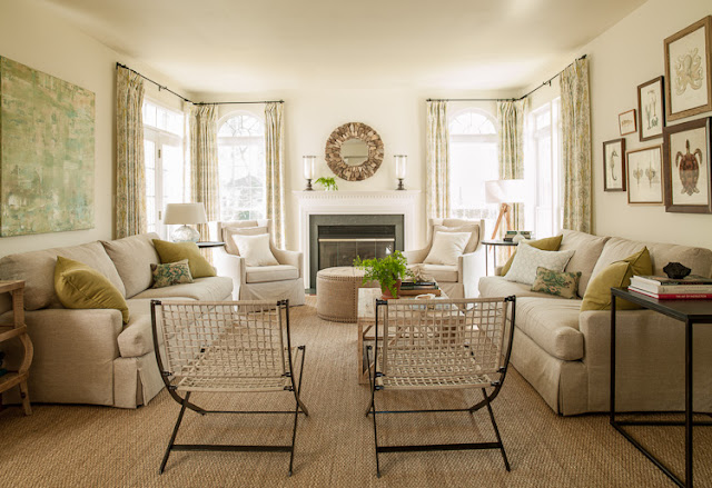
The dining room I'm sharing pictures of today was the type of room that I can see with pretty much crystal clarity in my mindseye as I'm creating the plan. It was easy for me to envision because it was a fairly square room and had an important focal wall that is seen right when you walk into the house. I worked with my clients throughout the first floor of their home (It was their family room I showed above, and you can view the full family room here) but the dining room was actually the first room we did, because it was empty. My client wanted a relaxed yet elegant dining room that made her go "ahhh." (And that's a sigh, not a yell ;) Like I mentioned in my previous post about this client, she & her family love to spend time on the water and she loves nature.
We started with this blank slate:
And ended up with this:
I was so excited about this plan when I presented it to my client. I typically work with my clients throughout almost their entire homes so the first presentation meeting for the first room or set of rooms is really important in setting the tone for the home and for determining how we're going to work together. As much as I love designing a home in its entirety, I also love for clients to get the chance to experience a room entirely through from conception to completion because after that, the trust between us is incredibly strong as we go through the rest of the home. Decorating a house can be worrisome for lots of people and so having this trust is key.
When I started working on the plans for this room, I knew I wanted to do a painted blue sideboard and a wood-topped table. I love a mix of painted and wood furnishings in a room and thought blue would be perfect for my client's coastal leanings. All of my client's inspiration rooms seemed to have slipcovered parsons chairs so we decided to go with those and I had them made with simple linen slips that didn't reach the floor, to keep things casual. I thought adding a casual striped dhurrie would bring the formality down another notch and relax everything a bit. The branch chandelier was one of the most important elements in the room to me & when I presented it to my client (at our first presentation meeting) I really wasn't sure that she would go for it. (I'll be honest, most clients wouldn't go for it.) I think I probably hugged her when she said "yes" to it like it was really no big deal. (Thanks Colleen!!! :)
{Custom Side board & Windsor Chairs by Furniture from the Barn}
For the artwork, we found these big black herb prints to go above the blue sideboard that would really create a dramatic focal point. We've used black accents throughout the room and I liked the idea of doing a big jolt of black in the middle of the room. We flanked the artwork with some gorgeous sconces by Julie Neil. We had curtains made in my "Live Paisley" in a custom brown colorway to bring a little bit more organic movement into the room.
And, although it doesn't look like it, we did repaint this room. The color we chose (my favorite go-to ivory, Benjamin Moore's "seashell" just had the slightest bit of glow to it that the original paint was missing. It's something that doesn't necessarily show in photos, but when you get the right light neutral up on a wall, it makes a room sing. It was that trust I mentioned that really made this project so special and such a pleasure to work on. The Bamboo Windsor Chairs initially made my client a bit nervous because she thought they might feel a bit too traditional, and so we held off on them. Once the room was installed without them though, my client was ready for them. They're one of my favorite elements in the room and that little addition of warm wood was just what it needed.
I'm off for an installation in DC, but hope you enjoyed!! I'll be sharing our clients' foyer soon too. And thank you, especially, to my client, for being so open-minded about everything. (She's the one who is an artist and doesn't know it yet. See here. She's said she's open to doing more paintings, so if you're interested, send me an email.) Have a great day!!

If you'd like help creating a home you absolutely love, contact me about our design services.


